The five Hs of book cover design
How the cover for Don’t Surrender Your Thinking came to life through collaboration, clarity, and patience. A behind-the-scenes look at working with designer Charlotte Mouncey, and how the HAHAH Method for AI turned out to be the same pattern for great human teamwork.
John Bennett

I'm not a graphic designer or illustrator. And I'm one of the apparently 1% of people who can visualise at all.* When asked to "picture" something, there's no image in my mind. But if you ask me what an apple looks like, I can think of words to describe it. Strangely, this somehow gives me a very strong understanding of how I want things to look, even if I can't picture them.
Knowing that my creative and technical skills were no match for my vision of how I wanted the cover for Don't Surrender Your Thinking to look, it was clear I needed the help of an accomplished book cover designer, and after researching a few recommendations, and some Zoom chats, it was clear that Charlotte Mouncey was the right person. I liked her previous work, and we quickly built the rapport that made it clear we could work together. Although, little did Charlotte know at that point about how pedantic I am.
The initial brief
I wanted an illustration that would show the fear that AI will replace us as dark clouds, a network pattern in the background to show AI as being everywhere, and a shining brain lighting up the clouds and the network around it, to show what happens when you keep thinking.
As I can't picture things, I put my description in to ChatGPT to see if the concept worked. Even with a few variations of my prompt, nothing came out that felt right, and I began to wonder whether my concept was achievable. I decided to try in Gemini instead, and ended up with something that gave me faith in my idea.
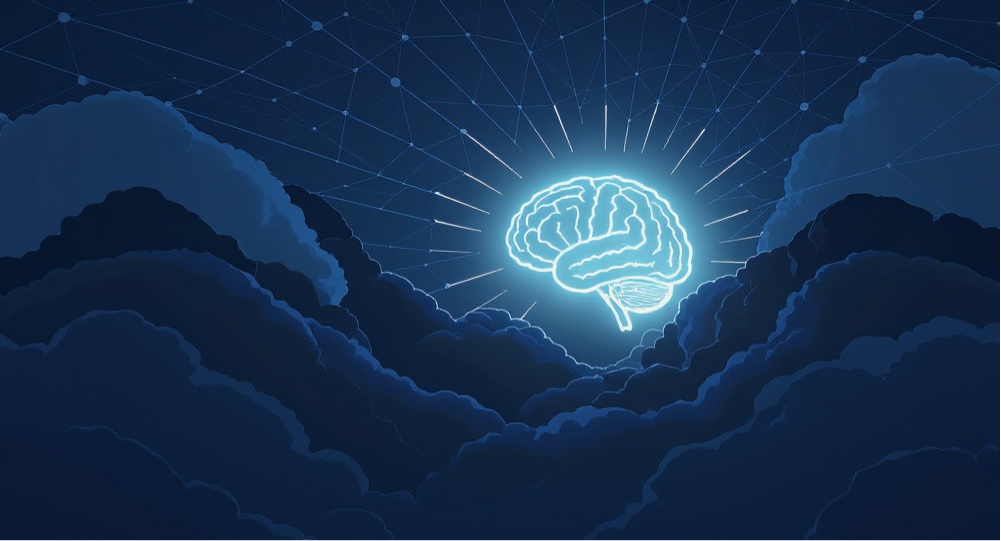
This had the core concept that I wanted of the dark clouds, the network, and the brain lighting everything up. I didn't really like the illustration style, but I could see that this could be developed to get something I was happy with.
To leave space for Charlotte's creative interpretation, I kept the brief I sent her simple: clouds on a sky of network patterns and a brain shining like the sun and lighting them up. For the same reason, I didn't share the proof of concept from Gemini.
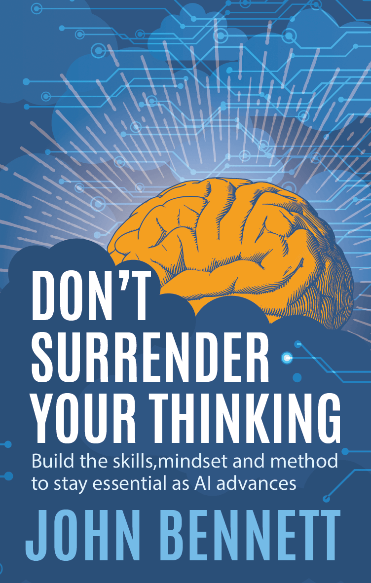
The first design
Charlotte's first design completely validated my instinct to use a human book cover designer. I loved her interpretation of how the network should look. The colours were perfect, and I really liked how she'd left-aligned the text. But I felt the subtitle was a little lost in between the title and my name.
I liked the brain, but wasn't sure about it being 3D when everything else was flat. And I felt that the network should be background and the clouds foreground, so no clouds behind the network, and no network on top of the clouds. And I wanted the brain to glow more and light up the network to show how our thinking interacts with it.
The revisions
The next version was much closer. The separation of the network and clouds had been established. The brain was flatter, but I didn't feel the curved lines worked. It also felt in front of the clouds, and I wanted the glow to be tighter but light up the network more.
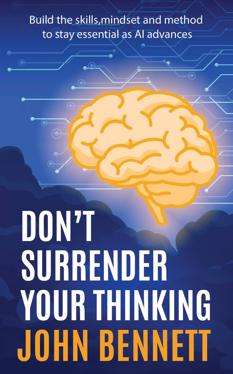
Version three arrived, and now the brain was just how I wanted it. I realised I had steered us wrong by asking for the glow to be tighter though, and I really wanted the network lines that went past the brain to be lit up in orange. I also felt the T in "Don't" was too close to the edge of the clouds.
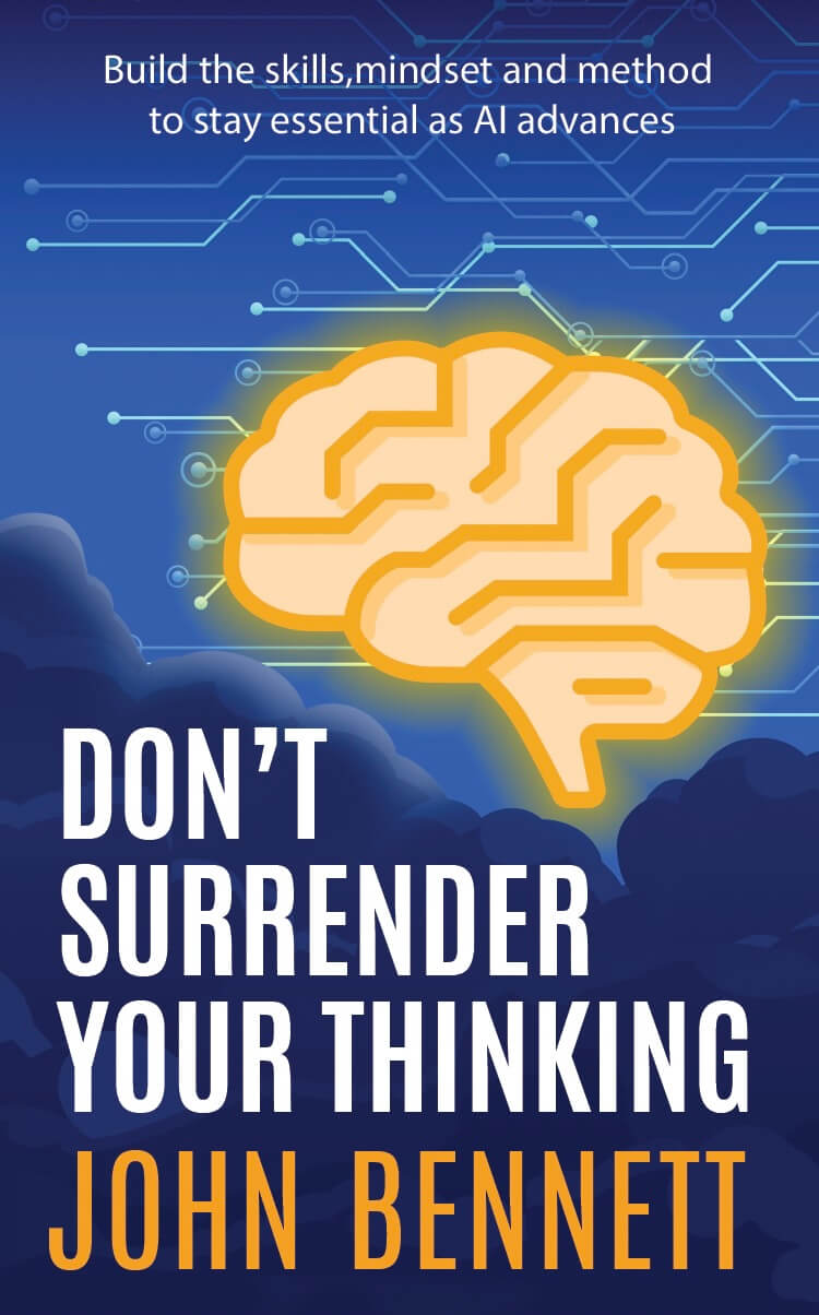
By this stage we were 99.5% of the way there. The glow was perfect and I liked the orange in the network near it, but wanted to make sure every line that passed the brain was orange, and ones that came close to it but didn't pass it were not. It also felt like the brain needed a bit more space.
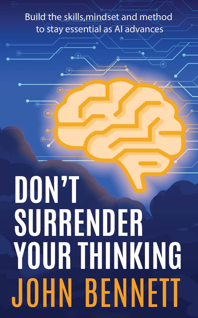
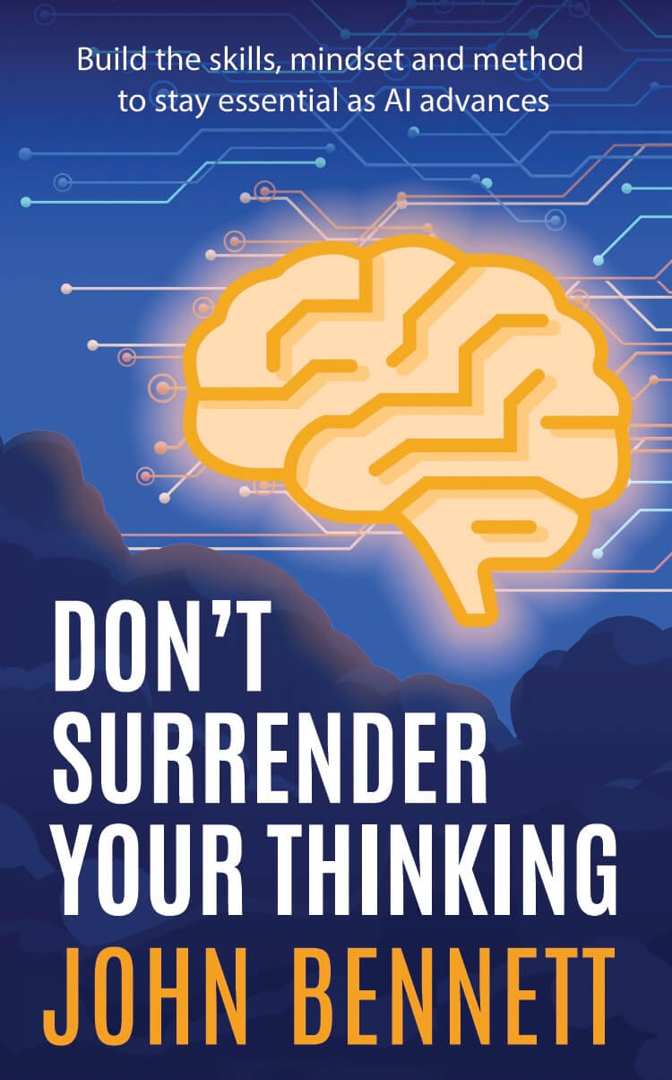
Thanks to Charlotte's patience and professionalism, we arrived at a design that I absolutely loved and perfectly captured what I wanted. Although, I was so fixated on the visual elements I failed to spot a missing space after "skills," in the subtitle. It didn't get past Zara Thatcher though, who is typesetting the book. So, after Zara's input, we arrived at our sixth and final version of the cover.
Human-Human-Human-Human-Human Collaboration
The cover was a true collaboration between my idea for the story I wanted to tell, and Charlotte's interpretation, skill and abundant patience. It occurred to me that the process was in many was similar to the HAHAH Method.
I set out my human intent to the appropriate level of detail (in this case, not as detailed as I would recommend with AI, because I specifically wanted human creativity to come to the fore.)
After the first draft, my human intervention steered the cover in the direction that was consistent with my intent. We went through a number of cycles until it was clear that the work was done, and more cycles would be unlikely to improve it.
Then I took responsibility for the final output with human judgement. As it happens, I wasn't thorough enough in that judgement, but that's on me.
Of course, the difference between the HAHAH Method and this collaboration was the draft and revision being created by a human. HHHHH rather than HAHAH.
*
Until recently, I thought it was just a peculiar quirk that meant I couldn't visualise. But then I saw a news article about it. The inability to visualise is called Aphantasia, and there's a lot of research about it here: https://aphantasia.com